
How to Prepare Print-Ready Files: PDF, Resolution, and Color Basics
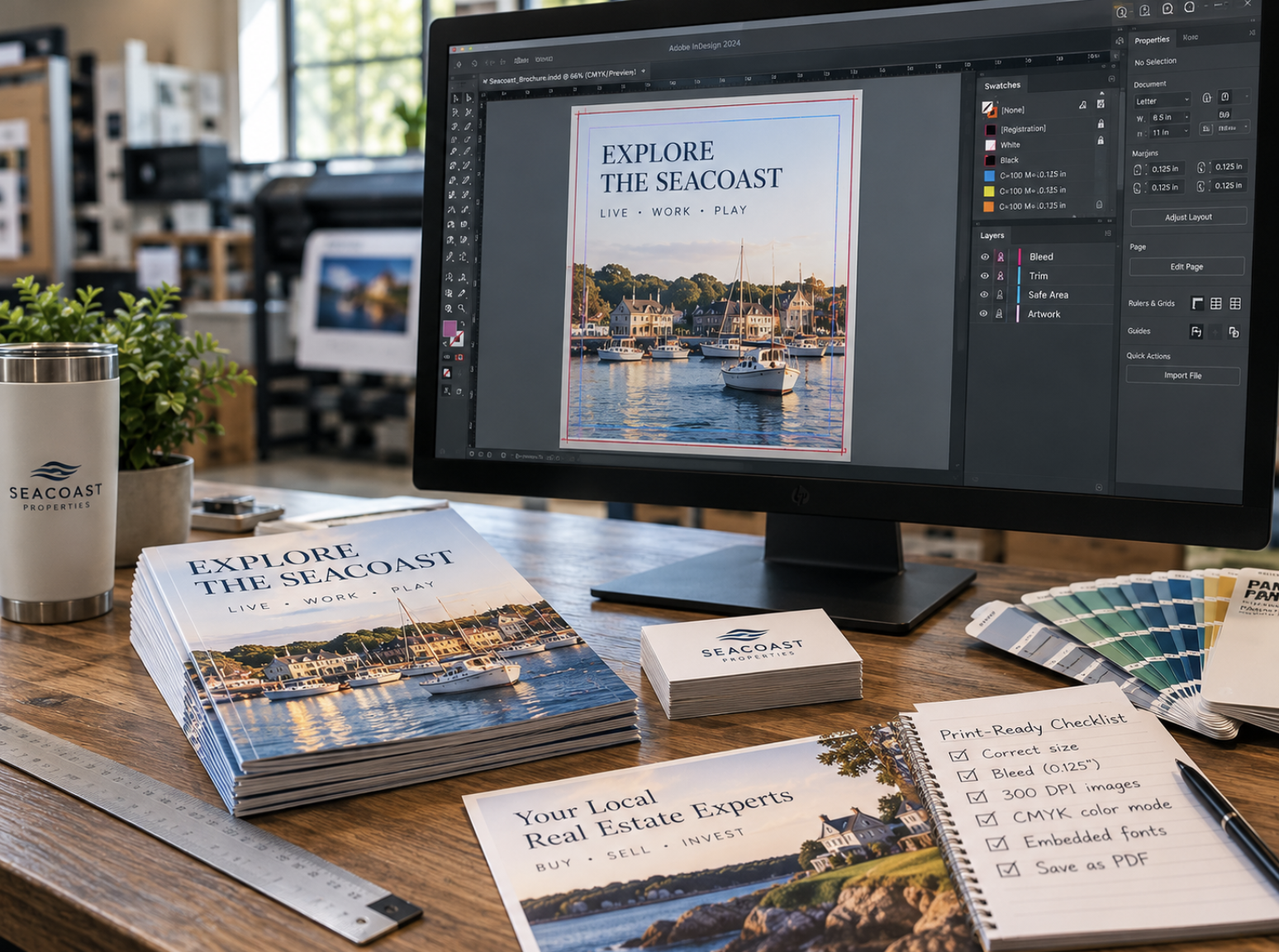
Creating an attractive design is only part of producing professional printed materials. Whether you're ordering business cards, brochures, promotional postcards, banners, or other marketing materials, the way your artwork is prepared can have a significant impact on the finished product.
A design may look sharp and colorful on a computer screen but still encounter problems during printing if the file contains incorrect dimensions, low-resolution images, missing fonts, insufficient bleed, or unsuitable export settings. These issues can lead to additional revisions, unexpected differences in appearance, or production delays.
The good news is that many common file preparation problems can be avoided with a little planning and a basic understanding of professional printing requirements.
You don't need to be an experienced graphic designer to understand the fundamentals. By learning how document dimensions, image resolution, color settings, typography, and PDF exports work together, you can communicate more effectively with your printing provider and prepare artwork with greater confidence.
This guide explains the essential steps to consider before submitting files for commercial printing.
1. Start With the Correct Document Size
One of the first steps in preparing a print-ready file is establishing the correct dimensions for the finished product.
Your document should be designed around the size of the item you're actually ordering rather than an arbitrary page size or a layout intended only for digital viewing.
For example, a standard business card, a promotional postcard, and a folded brochure each have different dimensions and production considerations. Designing at the correct size helps ensure that text, images, and other elements are positioned appropriately for the finished piece.
Understand Finished Size vs. Flat Size
Some printed products have a single finished dimension, while others require additional measurements.
A business card or flat postcard is relatively straightforward because the finished piece typically remains the same shape after trimming.
A folded brochure is different. It has a flat size before folding and a smaller finished size after the folding process is complete.
For instance, a common tri-fold brochure may begin as an 8.5-by-11-inch sheet that folds into a narrower format. The exact panel dimensions and fold allowances should be established before designing, as certain folding styles require adjustments to prevent panels from interfering with one another.
Whenever possible, confirm the intended finished dimensions and any folding requirements before beginning your layout.
Avoid Resizing Artwork at the Last Minute
Creating a design at one size and enlarging or reducing it immediately before printing can introduce problems.
Text may become too small, images may lose effective resolution, and margins may no longer look balanced.
If multiple sizes are needed, such as a postcard and a large promotional poster, it's often better to adapt the artwork intentionally for each format rather than simply scaling the original design.
2. Understand Bleed, Trim, and Safe Areas
Bleed, trim, and safe area are three of the most important concepts in commercial print file preparation.
They describe different regions of a printed layout and help account for small variations that can occur when materials are cut to their finished dimensions.
What Is Bleed?
Bleed is the portion of artwork that extends beyond the intended finished edge of a printed piece.
When a background color, photograph, or graphic should reach all the way to the edge, that artwork typically needs to extend slightly beyond the trim line.
This extra area helps prevent unintended white borders from appearing if minor variations occur during cutting.
For many common commercial printing projects, 0.125 inches of bleed on each side is a familiar specification. However, bleed requirements vary depending on the product, printing process, and production provider.
Always confirm the actual requirements before finalizing your file.
What Is the Trim Line?
The trim line represents the intended finished edge of the printed material.
After printing, certain products are cut down to their final dimensions. The trim line indicates where that cutting should occur.
Because cutting processes have normal production tolerances, artwork shouldn't depend on every cut occurring at precisely the same position.
That's why backgrounds extending beyond the trim line and important content staying away from the edge are both important.
What Is the Safe Area?
The safe area is the region inside the finished edge where essential information should remain.
Important elements such as logos, phone numbers, website addresses, headlines, and other critical text should have sufficient clearance from the trim line.
The appropriate safe margin depends on the product and its finishing requirements.
For example, a folded brochure or bound document may require additional attention to panel edges, folds, or binding areas.
A useful principle is to extend backgrounds into the bleed area while keeping important text comfortably inside the finished dimensions.
These simple layout decisions can help prevent common trimming-related problems.
3. Use Images With Appropriate Resolution
Image resolution plays a major role in how clearly photographs and other raster graphics reproduce in print.
An image that looks sharp on a phone or computer screen may appear blurry or pixelated when enlarged beyond its useful resolution.
This happens because digital images contain a finite number of pixels. As an image is enlarged, those pixels are spread over a greater physical area.
Understanding resolution helps you determine whether a photograph is suitable for the intended printed size.
What Does PPI Mean?
PPI stands for pixels per inch. It describes how many image pixels are available within each inch at a particular displayed or printed size.
For many close-viewed commercial printing applications, approximately 300 PPI at the final printed dimensions is a common target.
For example, a photograph intended to print at 4 by 6 inches would need approximately 1,200 by 1,800 pixels to provide 300 PPI at that size.
However, 300 PPI is not a universal requirement.
The appropriate image resolution depends on the printing process, image characteristics, viewing distance, and final product.
Large-Format Graphics Have Different Needs
A brochure is generally examined from a relatively short distance, making fine detail more noticeable.
A large banner or display graphic may be viewed from several feet away, which can change the effective resolution needed for an acceptable result.
This doesn't mean any low-resolution photograph will work for a large-format project. Enlarging a small web image significantly can still produce visible pixelation or softness.
The best approach is to use the highest-quality source artwork available and ask your printing provider about resolution requirements for the intended application.
Avoid Relying on Images Saved From Websites
Images downloaded from websites, copied from social media, or captured through screenshots are often optimized for digital viewing.
These files may not contain enough pixel data for professional printing at larger dimensions.
Whenever possible, use original photography, high-resolution image files, or appropriately licensed graphics intended for print use.
Also remember that increasing an image's PPI setting without adding genuine detail does not automatically improve its quality.
Good print reproduction begins with suitable source material.
4. Use Vector Artwork for Logos and Important Graphics
Not all digital graphics are constructed in the same way.
Photographs are typically raster images made from pixels, while vector graphics use mathematical paths to define shapes, lines, and other elements.
The distinction becomes especially important when preparing logos and graphics that may need to appear at different sizes.
A raster logo may look acceptable on a business card but become visibly pixelated when enlarged for a banner.
A properly prepared vector logo can generally be scaled from a small printed piece to a much larger display without the same loss of sharpness.
Common vector-based design formats include Adobe Illustrator files, certain EPS files, and PDFs containing vector artwork.
However, simply saving a low-resolution image inside a PDF or another vector-capable format does not convert that image into true vector artwork.
For businesses ordering multiple types of printed materials, maintaining a collection of approved, high-quality logo files can make future projects easier.
This is particularly useful when coordinating business cards, brochures, promotional signage, trade show graphics, and other branded materials.
If you're uncertain whether your logo files are appropriate, discussing the available artwork with your printer or designer before production is a sensible step.
5. Understand RGB, CMYK, and Print Color Differences
Color is another area where printed materials can look different from the original digital design.
Computer monitors, smartphones, and tablets typically display colors using RGB light, while many commercial printing processes reproduce colors using CMYK inks or other printing technologies.
These methods create color in different ways, so not every color visible on a screen can be reproduced identically in print.
What Is RGB?
RGB stands for red, green, and blue.
Digital displays use varying combinations of these colors of light to produce the images we see on screens.
Certain bright or highly saturated colors may appear especially vivid in RGB because of the way displays produce light.
What Is CMYK?
CMYK stands for cyan, magenta, yellow, and key, which generally refers to black.
Many commercial printing processes use these ink colors to reproduce a broad range of printed colors.
However, the available color range depends on the printing technology, inks, paper, and other production conditions.
Some bright colors seen on a monitor may appear different when reproduced using CMYK.
Should You Convert Every File to CMYK?
Not necessarily.
Different commercial printing workflows have different requirements. Some providers prefer artwork prepared in a specified CMYK color space, while others may accept RGB files and manage color conversion during production.
Converting a file without understanding the intended workflow can sometimes produce unexpected color changes.
The most reliable approach is to follow the file preparation and color profile guidance provided for your specific printing project.
For businesses with brand-critical colors, discussing color expectations and available proofing options before production can help reduce surprises.
It's also important to remember that paper stock, coating, lighting, and display calibration can influence how colors appear.
6. Choose Fonts Carefully and Preserve Them in the Final File
Typography affects both the appearance and readability of printed materials, but fonts can also create technical issues when artwork moves between computers or software applications.
A design may use a particular font that isn't installed on another system. If the file doesn't preserve that font correctly, the text may be substituted with a different typeface.
Font substitutions can change line breaks, spacing, text alignment, and the overall appearance of a layout.
Use Legible Typography
Before exporting your artwork, review whether the fonts are appropriate for the final printed size.
Avoid using very small body text, excessively thin lettering, or decorative fonts for essential information.
A brochure, business card, and large-format sign may require different typography approaches because readers encounter them at different distances.
Embed Fonts When Appropriate
Many professional PDF export workflows allow fonts to be embedded or appropriately subset within the finished file.
Embedding helps preserve the intended typography when the PDF is opened or processed on another system, subject to font licensing and the PDF export settings.
Some production workflows may have additional requirements, so confirm the preferred approach with your printer.
Check the Exported PDF
After creating the final PDF, open it and review the text carefully.
Look for unexpected font substitutions, changed line breaks, missing characters, and altered spacing.
Pay particular attention to contact information, disclaimers, and any small text that could become difficult to read after printing.
7. Export Your Artwork as a Properly Prepared PDF
PDF is one of the most widely used file formats in professional printing because it can preserve page dimensions, typography, vector graphics, raster images, and other layout elements within a single document.
However, not every PDF is automatically print-ready.
A PDF created for emailing or online viewing may use different settings from one intended for commercial production.
When exporting your artwork, consider the requirements for the specific project.
- Page dimensions: The correct finished size or required production dimensions.
- Bleed: Additional artwork beyond the trim edge when required.
- Fonts: Proper embedding or other treatment specified by the workflow.
- Image quality: Appropriate effective resolution and compression settings.
- Color management: Suitable color settings and profiles for the printing process.
- Page order: The correct sequence for multi-page documents.
- Printer specifications: Any required PDF preset, marks, or other production settings.
Some printers request particular PDF standards or export presets, while others provide their own file preparation instructions.
Avoid assuming that a generic "High Quality Print" export preset will always meet every commercial printing requirement.
If your project involves folding, binding, unusual dimensions, or other finishing processes, verify whether additional file setup instructions apply.
8. Prepare Multi-Page and Folded Documents Correctly
Brochures, booklets, catalogs, presentation materials, and other multi-page products require additional attention beyond preparing a single flat page.
For folded brochures, the position and dimensions of each panel must be considered before production.
Different folding styles can require different panel allowances, and a design that appears balanced on a flat screen may not align as intended after folding.
For multi-page documents, page order and binding requirements are also important.
For example, a booklet may have production considerations involving total page count, binding margins, and artwork placement near the spine.
The correct setup depends on the intended finishing method.
Rather than arranging pages into a printing layout yourself without guidance, ask your printer how the document should be supplied. Some production workflows prefer individual pages in reading order and handle imposition during prepress.
Confirming these requirements can help prevent unnecessary file revisions.
9. Review the Actual Exported File Before Submission
A common mistake in print production is reviewing the original design file carefully but failing to inspect the final exported PDF.
Export settings, missing resources, and document changes can sometimes introduce issues that weren't visible in the original application.
Before sending your artwork to a commercial printer, open the actual file you intend to submit.
Review it at the intended printed size whenever possible.
Check the Content
Verify names, dates, phone numbers, email addresses, website URLs, and other important details.
Spelling mistakes and outdated information can be particularly costly when they appear across a large quantity of printed materials.
Check the Layout
Confirm that text and graphics are positioned correctly, margins remain consistent, and no elements have unexpectedly shifted.
For folded pieces, review panel order and the intended reading sequence.
Check Images and Graphics
Look closely at photographs, logos, and other visual elements to identify blurriness, pixelation, or missing content.
Check Production Requirements
Verify the document dimensions, bleed, safe areas, and any other specifications provided by your printing partner.
Consider a Physical Proof
When practical, reviewing a physical sample or proof can help identify issues that are difficult to assess on a screen.
This may be especially valuable for projects involving important colors, complex folds, fine typography, or premium presentation materials.
Proofing options depend on the production process and should be discussed with the printing provider.
10. Common Print File Mistakes to Avoid
Even experienced designers occasionally encounter file preparation problems.
Being familiar with the most common issues can help you identify potential concerns before submitting an order.
- Incorrect document dimensions: Designing at the wrong size can create unexpected scaling or layout problems.
- Missing bleed: Background graphics that stop at the trim edge may leave unintended white borders after cutting.
- Text too close to the edge: Important information placed outside the recommended safe area may be affected by trimming.
- Low-resolution images: Photographs or graphics may appear soft or pixelated when enlarged.
- Missing or substituted fonts: Text may change appearance if fonts aren't preserved correctly.
- Unexpected color differences: Screen colors and printed colors may not match because of differences in color reproduction and viewing conditions.
- Incorrect page order: Multi-page projects may not appear in the intended reading sequence.
- Outdated information: Old phone numbers, addresses, logos, or promotional details can make otherwise professional materials unusable.
- Inappropriate export settings: Excessive image compression, missing fonts, or other PDF issues can interfere with production quality.
Identifying these problems early gives you more flexibility to make corrections before the project moves into production.
Print-Ready File Checklist
Before sending artwork to your printing provider, review the following:
- The document uses the correct finished dimensions.
- Bleed is included where required.
- Important text and logos remain inside the safe area.
- Images have appropriate effective resolution for their intended size.
- Logos and important graphics use high-quality source artwork.
- Fonts display correctly and are preserved as required.
- Color settings follow the project's printing specifications.
- The final PDF uses the appropriate export settings.
- Pages and panels appear in the correct order.
- Contact information and other details have been proofread.
- All linked images and graphics are present.
- The actual exported file has been opened and reviewed.
- Any required proofs or production approvals have been completed.
Not every project requires the same preparation process. A standard business card and a large-format outdoor banner may have different technical needs, so always confirm the specifications that apply to your particular order.
Professional Printing Starts With Proper File Preparation
Preparing print-ready artwork is about more than selecting the correct export button. Document dimensions, bleed, image quality, typography, color settings, and finishing requirements all influence how a design moves from a digital file to a physical printed product.
Understanding these fundamentals can help businesses avoid common mistakes, communicate more effectively with their printing partners, and make informed decisions throughout the production process.
You don't need to become an expert in commercial printing to prepare a successful project. The most important steps are to start with appropriate source materials, review your artwork carefully, and confirm any technical requirements that you're unsure about.
When those details are addressed early, the design and production process can become more predictable and efficient.
Need Help Preparing Artwork for Commercial Printing?
Since 2006, Elite Printing Group has provided commercial printing, graphic design, and personalized service to businesses and organizations. Based in the Seacoast of New Hampshire, we serve customers throughout New England and offer nationwide shipping.
Whether you're preparing business cards, brochures, promotional postcards, banners, or other printed marketing materials, our team can help you discuss your project requirements and explore suitable options.
Learn more about our Graphic Design Services, explore our Small Format Printing and Large Format Printing services, or Get a Quote to start your next project.