
Accessible Print Design: Making Marketing Materials Easier to Read
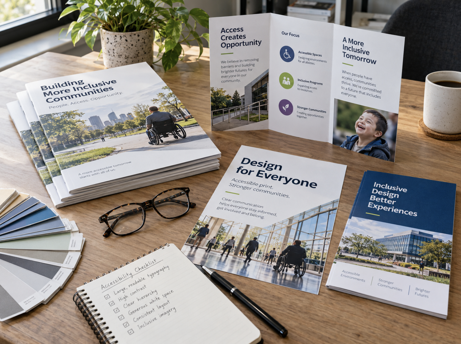
When businesses invest in brochures, flyers, postcards, signage, and other printed marketing materials, much of the attention naturally goes toward colors, imagery, and overall appearance. While these elements are important, an effective design must accomplish something even more fundamental: make information easy for people to read and understand.
Accessible print design focuses on creating materials that are clear, organized, and usable by as many people as reasonably possible, including individuals with visual impairments or other accessibility needs. It also benefits everyday readers who may be viewing a sign from a distance, scanning a brochure quickly, or trying to understand important information in less-than-ideal lighting.
Thoughtful typography, strong color contrast, logical layouts, and appropriate paper choices can all contribute to a better reading experience. Here are several practical ways businesses can improve accessibility and readability across their printed materials.
1. Choose Typography That Prioritizes Readability
Typography plays a central role in how effectively printed information is communicated. A font that looks attractive on a computer screen may become difficult to read when printed at a smaller size, particularly if it includes thin strokes, elaborate details, or tightly spaced characters.
For most business communications, it's best to choose typefaces that remain clear and recognizable at the intended viewing size. Simple serif and sans-serif fonts can both work well when used appropriately. The most important considerations are legibility, spacing, and consistency rather than choosing one particular font category.
Font size should also reflect how and where the material will be used. A brochure intended for close reading has different requirements from a banner displayed across a conference hall. Important text should be large enough to read comfortably under normal viewing conditions, while supporting information should remain legible without forcing readers to strain.
Avoid placing large amounts of text in all capital letters, using excessively condensed fonts, or relying on decorative scripts for essential information. These styles can be effective as occasional design accents, but they are generally less suitable for longer passages or important instructions.
A useful rule is to design for the final printed size, not just the appearance of the file on your screen. Reviewing a physical proof can reveal readability issues that aren't immediately obvious during the design process.
2. Use Strong Color Contrast to Improve Visibility
Color is one of the most recognizable parts of a company's branding, but attractive color combinations don't always provide sufficient contrast for comfortable reading.
Light gray text on a white background, for example, may create a modern appearance but can be difficult to read, particularly for people with reduced vision. Similarly, placing text over a busy photograph can make even relatively large lettering hard to distinguish.
Strong contrast helps important information remain visible. Dark text against a light background is a familiar and often effective choice, although appropriately contrasted light text on dark backgrounds can work equally well.
When designing printed materials, consider the relationship between the text and everything behind it. If you're placing lettering over an image, a solid background panel or carefully positioned overlay can improve clarity without compromising the overall design.
It's also important not to communicate essential information through color alone. For example, if an event schedule uses different colors to identify activities, include written labels so readers don't need to distinguish between colors to understand the information.
Remember that colors may appear differently in print than they do on a digital display. Paper stock, coatings, ink, and lighting conditions can all influence the finished appearance.
Reviewing printed samples is especially helpful when color contrast is essential to understanding the material.
3. Create a Clear Visual Hierarchy and Reading Order
An accessible layout should guide readers through information in a logical, predictable sequence. When every element competes for attention, even a well-written message can become difficult to follow.
Visual hierarchy establishes which information matters most and helps readers understand how individual sections relate to one another. This is typically achieved through a combination of headings, typography, spacing, alignment, and consistent design patterns.
For example, a promotional brochure might begin with a clear headline introducing the service, followed by a short explanation, a few supporting details, and a prominent call to action. Readers should be able to identify the primary message without searching through several unrelated sections.
White space is particularly valuable. Giving text, images, and headings sufficient room prevents a printed piece from feeling overcrowded and makes information easier to scan.
Consistency matters as well. If headings, subheadings, and body text follow predictable styles throughout a brochure or multi-page document, readers can navigate the material more comfortably.
Businesses should be especially careful with complex layouts that use multiple columns, overlapping elements, or unusual reading directions. Creative arrangements can be visually interesting, but they shouldn't make essential information difficult to locate.
The goal is to balance a distinctive design with a straightforward reading experience.
4. Make Forms, Contact Information, and Calls to Action Easy to Use
Accessibility becomes particularly important when printed materials require someone to take action.
Registration forms, appointment cards, event instructions, and informational handouts should communicate their purpose clearly and make the next step easy to understand.
For printed forms, use clearly labeled fields, adequate spacing, and sufficient room for written responses. Instructions should appear near the information they relate to, rather than forcing readers to search elsewhere on the page.
Contact information also deserves special attention. Phone numbers, email addresses, website URLs, and physical addresses should be presented in readable type with enough contrast to stand out from surrounding content.
If you're using a QR code, include a brief description of its destination and consider providing a readable website address as an alternative. Not every customer will have immediate access to a smartphone or be comfortable scanning a code.
Calls to action should be specific and easy to recognize. Instead of surrounding the reader with several competing instructions, identify the most important next step and give it appropriate visual emphasis.
Whether the objective is requesting a quote, registering for an event, or contacting your business, clear instructions can make the experience easier for everyone.
5. Consider Paper Stock, Finishes, and Lighting Conditions
Accessible print design doesn't stop when the digital artwork is completed. The physical characteristics of the finished product can influence how comfortably people interact with it.
Paper stock and coatings affect reflectivity, texture, opacity, and the overall reading experience. For example, highly glossy surfaces may produce reflections under bright lighting, which can make certain text-heavy materials more difficult to read.
Matte or lower-glare finishes may be worth considering for brochures, instructional documents, forms, and other pieces where readability is a primary concern.
Paper opacity is another consideration. If text or images from the reverse side of a sheet are visible through the page, they may interfere with the information on the front. Selecting appropriate stock can help minimize distracting show-through.
For materials displayed in public spaces, viewing conditions matter just as much as the material itself. Directional signage placed in a dim hallway requires different considerations from a promotional banner viewed outdoors in daylight.
Before approving a project, think about where the materials will be used, how long readers will interact with them, and whether they will be held, displayed, or viewed from a distance.
Elite Printing Group's small format printing services and large format printing services can support different applications, from handouts and brochures to banners and signage.
6. Provide Alternative Ways to Access Important Information
Even with careful design, a single printed format may not meet every reader's needs. Providing alternative ways to access important information can make communication more flexible and inclusive.
For example, a printed brochure could include a short website address directing readers to a digital version of the content. A QR code may also provide convenient access, particularly for customers who prefer reading information on their own devices.
However, simply placing a PDF online doesn't automatically make it accessible. Digital materials should also be designed and evaluated for accessibility, including appropriate document structure, readable text, and compatibility with relevant assistive technologies.
For especially important communications, organizations may need to consider additional formats or accommodations depending on their audience and applicable requirements.
Accessible print design is not about replacing physical materials with digital alternatives. It's about recognizing that people access information in different ways and making reasonable efforts to support those differences.
7. Review Your Printed Materials Before Final Production
One of the most effective ways to identify readability problems is to examine a physical proof before moving forward with a larger print run.
A design may appear balanced and attractive on a large monitor while revealing issues at its actual printed dimensions. Small text, insufficient contrast, crowded sections, or reflections from certain finishes can become more noticeable when viewing the finished piece.
When reviewing a proof, consider the following questions:
- Typography: Is essential information comfortably readable at the intended viewing distance?
- Contrast: Does the text stand out clearly from its background?
- Layout: Can readers quickly identify the headline, supporting details, and next step?
- Spacing: Are paragraphs, sections, and form fields given adequate room?
- Material: Does the paper or finish support the intended reading experience?
- Navigation: Are contact details, instructions, and calls to action easy to find?
- Alternatives: Is another way to access important information available when appropriate?
It can also be helpful to gather feedback from people who weren't involved in creating the design. Someone seeing the material for the first time may notice confusing layouts or unclear instructions that the original designer has become accustomed to.
These practical reviews can improve readability, although they are not a substitute for a formal accessibility evaluation when one is required.
Better Readability Creates Better Business Communication
Accessible print design is ultimately about making information easier to understand and use. Clear typography, thoughtful contrast, organized layouts, and appropriate materials help businesses communicate more effectively with a wider audience.
These principles don't require sacrificing creativity or brand identity. In many cases, the same decisions that improve accessibility also create a cleaner, more professional appearance.
Whether you're developing a company brochure, preparing direct mail, designing event signage, or updating customer-facing forms, considering readability from the beginning can help you create printed materials that serve their intended purpose.
For projects with specific legal or regulatory accessibility requirements, consult the applicable standards and qualified accessibility professionals to determine what additional measures may be necessary.
Create Clear, Professional Printed Materials With Elite Printing Group
Since 2006, Elite Printing Group has helped businesses bring their ideas to print through commercial printing, graphic design, and personalized service. Based in the Seacoast of New Hampshire, we serve businesses throughout New England and ship nationwide.
Whether you're updating an existing brochure or developing a new marketing piece, our team can help you explore design and printing options suited to your project.
Explore our Graphic Design Services or Get a Quote to discuss your next printing project.