
How to Keep Your Brand Consistent Across Printed Materials
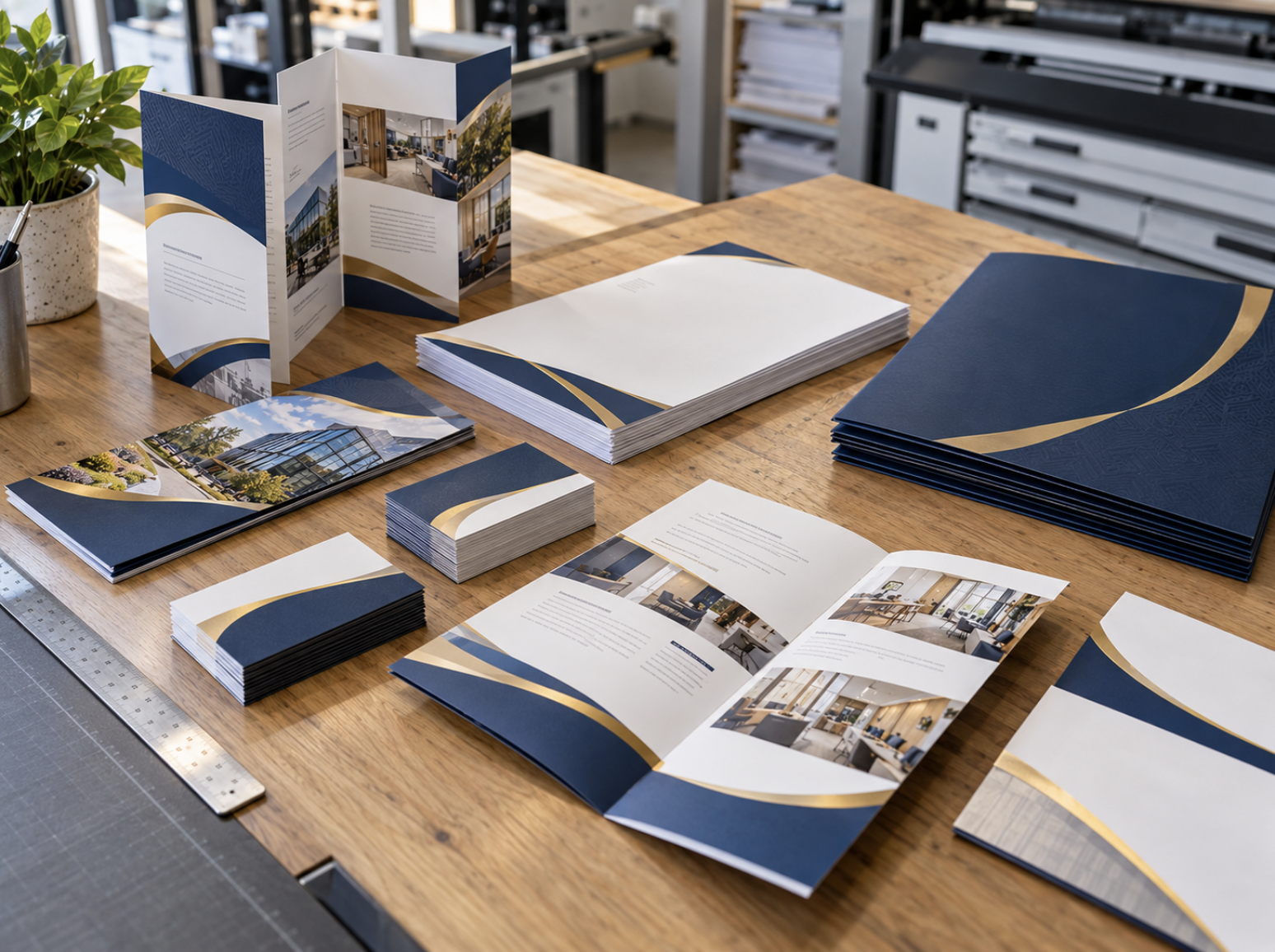
Your company's brand is more than its logo. It's the combination of colors, typography, imagery, messaging, and visual details that customers associate with your business. Whether someone visits your website, receives a promotional postcard, picks up a brochure, or sees your signage at an event, each interaction contributes to their overall impression of your organization.
For businesses that regularly produce printed marketing materials, maintaining a consistent brand identity can become challenging. Business cards may be ordered by one department, brochures developed by another, and banners prepared for events by an outside designer. Without clear guidelines and approved artwork, small differences can accumulate across these materials.
A logo may appear in slightly different colors, an outdated font might be used on a new brochure, or employees may order business cards using an older template. Individually, these inconsistencies may seem minor, but together they can create a disconnected and less professional presentation.
Consistent branding helps customers recognize your business across different materials and experiences. It also makes it easier for employees and designers to create new marketing pieces without repeatedly making decisions about how the company should be represented.
Here's how businesses can build a more organized approach to brand consistency across their printed materials.
1. Understand Why Brand Consistency Matters in Print
Printed materials often represent your company when an employee isn't present to explain the business personally.
A brochure may be picked up at a trade show, a postcard could arrive in a customer's mailbox, and a business card might be kept for months after a networking event. Each piece should communicate a recognizable identity, even when the format and message differ.
When printed materials use consistent logos, colors, typography, and messaging, they help reinforce that the communications come from the same organization.
This becomes especially important for businesses with multiple locations, departments, or employees who regularly interact with customers.
For example, a professional services company might use business cards during consultations, brochures to explain its offerings, and banners at industry events. Although each product serves a different purpose, the overall appearance should still feel connected.
Brand consistency can support several practical objectives:
- Recognition: Familiar visual elements make it easier for customers to identify your business.
- Professional presentation: Coordinated materials help create a more organized impression.
- Clear communication: Consistent terminology and messaging reduce unnecessary confusion.
- Efficient design: Approved standards provide a starting point for new projects.
- Internal organization: Employees can more easily identify which artwork and templates should be used.
Consistency doesn't require every printed piece to look identical. The goal is to maintain a recognizable identity while adapting each design to its purpose.
2. Start With a Central Collection of Approved Brand Assets
One of the simplest ways to improve brand consistency is to organize the files employees and designers use when creating printed materials.
Without a central collection of approved assets, team members may rely on logos saved from old emails, screenshots from the company website, or outdated presentation files.
These versions can differ in color, resolution, proportions, or other important details.
A basic brand asset collection should include the current company logo, approved color references, typography information, and any other graphics used regularly in marketing materials.
Maintain the Correct Logo Files
Your company may have several approved versions of its logo for different applications.
For example, a full-color logo may be appropriate for light backgrounds, while an alternative version may be needed for darker surfaces.
Keeping these files clearly labeled can help employees select the appropriate version.
For professional printing, vector artwork is often preferable for logos because it can generally be scaled without losing sharpness.
Common vector-capable formats include properly prepared PDF, EPS, and Adobe Illustrator files.
However, simply placing a low-resolution image inside a PDF does not automatically convert it into vector artwork.
Keep Approved Color References Accessible
A brand color should be more specific than a general description such as "dark blue" or "gold."
When available, keep approved digital and print color references so designers and printing providers have a clearer starting point.
These references may include RGB or hexadecimal values for digital applications and appropriate CMYK or spot-color specifications for printing.
The exact format depends on how the company's brand identity was developed and which production methods are being used.
Organize Files Clearly
A central folder or approved asset library is only helpful when employees know which files are current.
Use clear file names, remove or archive obsolete versions, and identify who is responsible for maintaining approved artwork.
This reduces the likelihood of outdated files being used when new materials are ordered.
3. Establish Practical Brand Guidelines for Printed Materials
A brand style guide provides a reference for how your company's visual identity should be presented.
Large organizations may maintain extensive brand standards, but smaller businesses can benefit from a straightforward document covering the most important elements.
The goal is to give employees, designers, and printing partners enough information to maintain consistency without making every project unnecessarily complicated.
A useful print-focused brand guide might include:
- Logo usage: Approved versions, proportions, clear space, and examples of incorrect placement.
- Brand colors: Primary and secondary colors with relevant color references.
- Typography: Approved headline and body fonts, including appropriate alternatives.
- Imagery: Preferred photography styles, illustration approaches, and graphic treatments.
- Tone and messaging: Guidance for describing the company and its services.
- Contact information: Standard formatting for phone numbers, addresses, email addresses, and website URLs.
- Layout examples: Samples of approved business cards, brochures, stationery, and other recurring materials.
For businesses that regularly produce marketing materials, including examples of actual printed pieces can be particularly useful.
An approved business card layout, for example, gives employees a clear reference when requesting cards for new team members.
Similarly, a standardized brochure template can help maintain a consistent appearance across different service categories.
Brand guidelines should remain practical and flexible enough to support the company's changing needs.
4. Understand Why Colors Can Look Different in Print
Color consistency is one of the more technical aspects of maintaining a recognizable brand.
A company may use the same digital color values across several designs and still notice differences when the materials are printed.
This happens because screens and printing systems reproduce color differently.
Digital displays typically use RGB light, while many commercial printing processes use CMYK inks or other color systems. Paper stock, coatings, inks, printing methods, and lighting conditions can also influence how finished colors appear.
As a result, identical on-screen colors do not automatically guarantee identical printed results.
For example, a company logo printed on uncoated letterhead may appear somewhat different from the same logo printed on a glossy brochure.
Even when both products use approved artwork, the materials and production conditions can influence the appearance.
Use Appropriate Color Specifications
If your business has established print color references, provide them when preparing artwork.
For brand-critical projects, discuss the appropriate color workflow and available proofing options with your printing provider.
Avoid assuming that converting every file to CMYK will automatically produce the most accurate result. File preparation requirements can vary depending on the printing process.
Consider Paper and Finish
Matte, gloss, coated, and uncoated stocks can influence the way colors are perceived.
When coordinating materials across several formats, it's helpful to recognize that different paper choices may produce slightly different visual results.
The objective is to manage those differences thoughtfully rather than promise perfect color matching across every material and printing process.
Review Samples When Practical
For important branded materials, reviewing appropriate printed samples or proofs can help identify unexpected differences before a larger order is produced.
The available proofing methods depend on the project and printing provider.
5. Keep Typography Consistent Across Marketing Materials
Typography contributes significantly to a brand's personality.
A business that uses clean, modern lettering on its website but switches to several unrelated fonts across brochures and printed advertisements may create an inconsistent visual impression.
Establishing a small set of approved fonts helps create recognizable marketing materials.
For example, a company might use one typeface for headlines and another for body text across its business cards, brochures, and presentation materials.
That doesn't mean every printed product should use identical font sizes.
A large-format banner needs typography that can be read from a distance, while a brochure may contain smaller text intended for close reading.
The important principle is to maintain a consistent typographic identity while adapting size, spacing, and layout to the format.
Avoid Using Too Many Fonts
Combining several unrelated typefaces can make a design feel cluttered or disconnected.
In many cases, a limited set of complementary fonts provides enough flexibility for different applications.
Prioritize Readability
Even when a typeface is part of the company's brand identity, it still needs to function effectively in the finished design.
Decorative lettering may work well in a short headline but be less appropriate for long paragraphs or important contact information.
Preserve Fonts in Print Files
When submitting artwork for printing, fonts should be handled according to the printing provider's file preparation requirements.
Properly prepared PDFs can help preserve intended typography and prevent unwanted substitutions, subject to the file settings and font licensing.
Consistent typography is both a visual design decision and a practical production consideration.
6. Adapt Your Branding to Different Print Formats
One of the most important principles of brand consistency is understanding that different printed products require different design approaches.
A business card, brochure, direct mail postcard, and large banner cannot always use the same layout successfully.
However, they can share recognizable visual elements.
Business Cards
Business cards generally prioritize the company name, employee information, and essential contact details.
Consistent logo placement, typography, color usage, and overall formatting can help ensure that cards issued to different employees appear connected.
Brochures
Brochures typically provide more room for detailed information, photography, and service descriptions.
They may include several sections, but the design should still follow the company's established color palette, fonts, and visual identity.
Direct Mail Postcards
Promotional postcards often need to communicate a focused message quickly.
Although the design may be more campaign-oriented, the company logo, brand colors, and messaging style should remain recognizable.
Large-Format Banners and Signs
Banners and signage frequently need to be read from a greater distance.
This may require larger typography, simpler messaging, and fewer design elements than a brochure.
The brand identity should remain consistent, but the composition needs to be adjusted for the viewing environment.
Elite Printing Group provides Small Format Printing and Large Format Printing services for businesses preparing different types of marketing materials.
The goal is consistent branding, not identical layouts.
7. Keep Your Messaging and Contact Information Accurate
Visual consistency is important, but branding also includes the words and information customers associate with your business.
A company may use the correct logo across every printed piece while still presenting conflicting service descriptions or outdated contact details.
For example, an older brochure might describe a service differently from the company's current website. A business card could contain a previous office address, while a promotional flyer lists an outdated phone number.
These inconsistencies can create confusion and make the business appear less organized.
To prevent this, establish a standard reference for important company information.
This might include:
- Official company name.
- Approved business description.
- Current service categories.
- Primary phone number.
- Website URL.
- Email addresses.
- Physical business locations.
- Approved terminology for products and services.
Review this information periodically, especially before reordering commonly used printed materials.
For organizations with several employees or locations, clearly identify who is responsible for approving updates.
When important business information changes, communicate those changes to anyone preparing or ordering printed materials.
This helps prevent old versions from continuing to circulate after the company has moved forward.
8. Standardize Templates for Frequently Ordered Products
Many businesses repeatedly order the same types of printed materials.
Business cards, brochures, presentation materials, and certain promotional products may be reordered throughout the year.
Without standardized templates, employees may spend unnecessary time rebuilding designs or locating the correct files.
Creating approved templates can make recurring printing more organized.
For example, a business card template might preserve the company logo, typography, colors, and layout while allowing an employee's name, title, and contact information to change.
A brochure template might establish consistent heading styles, margins, and branding while allowing different service descriptions to be inserted.
The advantages of standardized templates may include:
- More consistent visual presentation.
- Less reliance on outdated artwork.
- A clearer starting point for new materials.
- Easier coordination across employees.
- More organized repeat ordering.
However, templates still need to be maintained.
When branding or contact information changes, approved files should be updated to reflect the current standards.
For businesses that regularly order materials across multiple locations, a centralized ordering solution may provide an additional way to manage approved templates.
9. Consider Centralized Ordering for Multi-Location Businesses
Brand consistency can become more difficult when several locations or departments order printed materials independently.
A company with multiple offices may want each location to use the same approved business card design while allowing individual addresses or phone numbers to vary.
Franchise organizations may face similar requirements when coordinating materials across different operators or branches.
A centralized ordering process can help establish clearer standards for how printed materials are requested and produced.
Elite Printing Group offers Branded Online Portals designed to support centralized print ordering, pre-approved templates, and recurring printing needs for corporate teams and multi-location organizations.
Depending on how a portal is configured, approved materials can be organized so authorized users have a more consistent starting point when placing orders.
This can help reduce the likelihood of employees selecting outdated files or independently recreating standard designs.
However, centralized ordering doesn't eliminate the need for accurate information, appropriate approvals, and ongoing management.
The system should support the organization's workflow rather than replace the responsibility to review and maintain approved materials.
For smaller businesses with occasional printing needs, a simpler shared asset library and internal approval process may be sufficient.
10. Coordinate Print Branding With Your Digital Presence
Customers rarely interact with a business through only one channel.
Someone might discover a company through an online search, visit its website, receive a promotional postcard, and later attend an event where the business has printed signage.
Although these interactions occur in different formats, they should feel connected.
Consistent branding helps customers recognize that the website, printed materials, and physical displays represent the same organization.
Use Recognizable Visual Elements
Logos, primary colors, typography, and imagery styles should remain reasonably consistent across digital and printed communications.
However, remember that screen and print color reproduction can differ.
Maintain Consistent Messaging
A brochure should accurately reflect the services and information presented on the company's website.
If a service changes, consider whether existing printed materials need to be updated as well.
Make Online Follow-Up Easy
Printed materials often direct customers toward a website, online form, or other digital destination.
Check that website URLs and QR codes are accurate and lead to relevant information.
For example, a direct mail postcard promoting a particular service may benefit from linking to the corresponding service page rather than an unrelated destination.
Combining consistent branding with a clear customer journey helps printed materials support broader marketing efforts.
11. Review Brand Consistency Before Approving Print Orders
Even when approved templates and brand guidelines are available, a final review remains important.
Small inconsistencies can be introduced during design revisions, file preparation, or the process of adapting artwork to a new format.
Before approving a printing project, review the finished design against the company's current brand standards.
Brand Consistency Checklist
- The correct, approved logo is being used.
- Logo proportions and placement follow established guidelines.
- Brand colors use the appropriate available specifications.
- Headline and body typography are consistent with the brand.
- Photography and graphic elements match the intended visual style.
- Business names and service descriptions are accurate.
- Phone numbers, website URLs, and email addresses are current.
- The design is appropriate for the finished product and viewing distance.
- Important text remains readable at the intended print size.
- Artwork is prepared according to the project's printing requirements.
- Relevant employees or decision-makers have approved the final design.
This review doesn't need to become an unnecessarily complex process.
For many businesses, a simple checklist and a designated final approver can help prevent common mistakes.
The objective is to maintain consistency while allowing printed materials to evolve with the company's needs.
12. Build a Sustainable Brand Management Process
Maintaining a consistent brand isn't a one-time project.
As businesses introduce new services, hire employees, open locations, and update their marketing strategies, printed materials need to evolve as well.
The most effective approach is to establish a manageable system for reviewing and maintaining brand assets.
This may involve assigning responsibility for approved logos and templates, establishing a regular review of frequently ordered products, and ensuring employees know where to find current artwork.
For example, a business could review its primary brochures and business card templates whenever significant contact information or service changes occur.
Organizations with more extensive printing needs may also benefit from periodically evaluating their ordering processes and inventory.
Elite Printing Group offers Free Print Audits for businesses interested in reviewing their printing needs and exploring opportunities to improve their approach.
The exact scope of an audit should be discussed with the company.
The goal is not to prevent the brand from changing. It's to ensure that changes are applied thoughtfully across the materials customers actually encounter.
Consistent Branding Creates a More Connected Customer Experience
Brand consistency across printed materials helps businesses communicate a recognizable identity, whether the customer is holding a business card, reading a brochure, receiving a postcard, or viewing a promotional banner.
Achieving that consistency requires more than using the same logo.
Approved artwork, coordinated colors, readable typography, accurate messaging, consistent templates, and organized ordering processes all contribute to the overall result.
Businesses don't need an elaborate brand management system to begin improving consistency. Establishing a central collection of approved files, creating practical guidelines, and reviewing printed materials regularly can provide a valuable starting point.
As printing needs become more complex, additional tools and standardized ordering processes may help maintain that organization across teams and locations.
The goal is simple: Every printed piece should look and feel like it belongs to the same business.
Keep Your Printed Materials Consistent With Elite Printing Group
Since 2006, Elite Printing Group has provided commercial printing, graphic design, and personalized service to businesses and organizations. Based in the Seacoast of New Hampshire, we serve customers throughout New England and offer nationwide shipping.
Whether you're updating business cards, developing coordinated marketing materials, or exploring a more organized ordering process, our team can help you discuss your printing needs and available options.
Explore our Graphic Design Services, learn more about our Branded Online Portals, or Get a Quote to discuss your next project.