
Matte vs. Gloss: Choosing the Right Print Finish
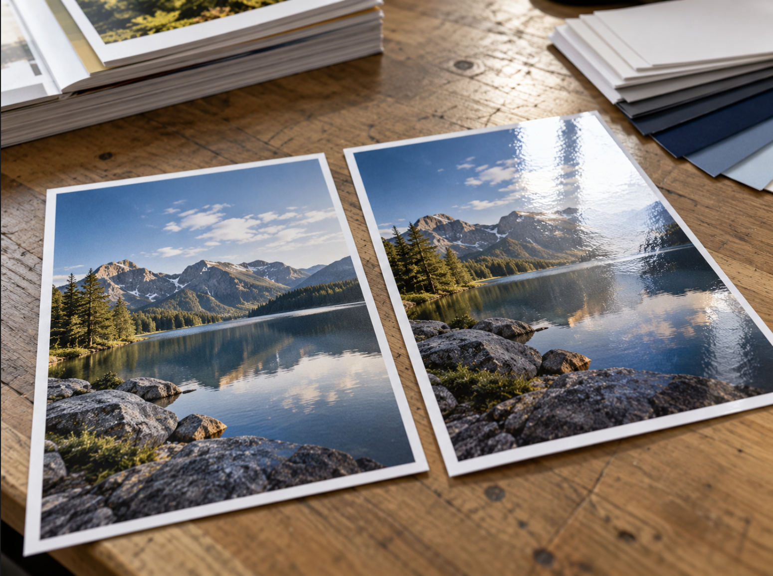
When preparing business cards, brochures, postcards, flyers, or other marketing materials, many businesses focus on the design itself. Colors, typography, photographs, and messaging all influence how the finished piece will look, but another important consideration is sometimes overlooked: the paper finish.
The finish you choose can affect the appearance, feel, and readability of your printed materials. Two of the most familiar options in commercial printing are matte and gloss finishes, each offering a different visual presentation.
A glossy brochure may emphasize vibrant photography and colorful graphics, while a matte business card can create a more understated, professional appearance. Neither option is automatically better than the other. The right choice depends on the purpose of the printed piece, how customers will interact with it, and the impression you want your business to communicate.
Understanding the differences between matte and gloss can help you make more informed decisions when planning your next commercial printing project.
1. What Is a Matte Print Finish?
A matte finish has a relatively low level of surface shine compared with a gloss finish. It generally produces a softer, more subdued appearance that allows printed text and graphics to be viewed with fewer distracting reflections.
Matte finishes are often associated with a clean, understated presentation, making them a common consideration for professional marketing materials, business stationery, brochures, and presentation pieces.
One of the main advantages of matte is that it tends to reflect less direct light than a glossy surface. This can be helpful for text-heavy materials that readers may examine under different lighting conditions.
For example, a company preparing an informational brochure with detailed service descriptions may prefer a less reflective surface that supports comfortable reading.
Matte can also complement minimalist designs, neutral color palettes, and layouts that rely on typography rather than highly saturated photography.
However, matte isn't necessarily the ideal choice for every project. Some matte papers or coatings may produce a different visual impression of color and image contrast than comparable glossy options.
The exact appearance depends on the specific paper stock, coating, printing method, and artwork.
Common Applications for Matte Finishes
Matte may be worth considering for:
- Business cards: Particularly when a restrained, professional presentation is desired.
- Corporate brochures: Especially when readability and detailed information are priorities.
- Presentation materials: Documents intended to be reviewed closely during meetings.
- Informational flyers: Printed pieces containing significant amounts of text.
- Professional marketing collateral: Materials using clean typography and subtle visual elements.
The goal is to select a finish that supports the content and intended use rather than choosing matte simply because it appears more formal.
2. What Is a Gloss Print Finish?
A gloss finish produces a shinier surface that reflects more light than a matte finish.
Depending on the paper, coating, and printing process, gloss can create a polished appearance and help photographs and colorful graphics appear more vivid.
This makes gloss a popular consideration for image-focused marketing materials, promotional brochures, product photography, and printed pieces where visual impact is a priority.
For example, a business preparing a brochure featuring high-quality photographs may appreciate how a glossy surface presents detailed imagery and strong colors.
Similarly, a promotional postcard with bold graphics could benefit from the visual character of a gloss-coated paper.
However, the same reflectivity that gives gloss its distinctive appearance can also create glare under certain lighting conditions.
When a glossy piece is viewed beneath bright overhead lights or near a window, reflections may make some text more difficult to read.
This doesn't mean glossy materials are inherently difficult to read. Proper typography, contrast, and layout can help maintain clarity.
It simply means that lighting and viewing conditions should be considered when selecting the finish.
Common Applications for Gloss Finishes
Gloss may be a good fit for:
- Photography-rich brochures: Printed materials where images are a central part of the presentation.
- Promotional postcards: Mailers using bold visuals and colorful designs.
- Product marketing materials: Pieces featuring detailed product photography.
- Event promotions: Flyers and materials where vibrant imagery supports the message.
- Selected retail materials: Printed communications intended to create a polished visual impression.
As with matte, the exact result depends on the paper stock, production process, and the design being printed.
3. Matte vs. Gloss: Key Differences
Although both finishes can produce attractive professional results, they differ in appearance, reflectivity, and suitability for certain applications.
| Consideration | Matte Finish | Gloss Finish |
|---|---|---|
| Surface appearance | Subtle, low-shine | Shiny, more reflective |
| Visual character | Understated and refined | Bright and polished |
| Photography | Often produces a softer visual impression | Can emphasize image vibrancy |
| Glare | Generally less reflective | More prone to reflections |
| Text readability | Often comfortable under varied lighting | Can be affected by strong glare |
| Handwriting | Depends on the stock and coating | Some coated surfaces can be difficult to write on |
| Common uses | Business cards, text-heavy brochures, presentations | Photo brochures, promotional postcards, image-focused materials |
These are general characteristics rather than absolute rules.
Two matte papers can have noticeably different appearances, just as two glossy stocks may vary in texture, reflectivity, and printed color.
A physical sample is often the most useful way to evaluate the difference.
4. How Paper Finish Affects Colors and Photography
One of the most noticeable differences between matte and gloss appears when printing colorful images.
A glossy finish can enhance the perception of contrast and color saturation in certain applications. This may make it appealing for brochures featuring product photography, travel imagery, food photography, or other visuals where rich colors are an important part of the design.
Matte finishes often create a softer visual impression because the surface reflects light differently.
That softer appearance can work particularly well for restrained branding, subtle color palettes, and designs emphasizing typography.
However, it's important to remember that the finish doesn't work independently from the rest of the printing process.
Paper brightness, coating, ink absorption, color management, and printing technology can all affect the final result.
Consider the Purpose of the Images
If your brochure relies heavily on photographs to communicate its value, the way those images reproduce may be a significant factor in choosing a finish.
If your design is primarily informational, with smaller supporting photographs and large areas of text, reduced glare may be more important than maximizing visual intensity.
Neither approach is inherently superior.
The right finish should reinforce the content rather than distract from it.
Review Samples Before Making a Final Decision
Colors on a computer screen don't always match how they appear on a printed surface.
Whenever practical, ask about suitable paper samples or proofing options, especially when color presentation is critical to your brand.
Comparing actual printed samples can help you understand how a particular stock and finish will affect the finished piece.
5. Which Finish Is Better for Readability?
Readability is an important consideration for brochures, flyers, forms, informational handouts, and other materials that contain substantial text.
A matte finish may offer an advantage in certain environments because its lower reflectivity can reduce distracting glare.
For example, a brochure intended to be read under bright office lighting may be easier to view on an appropriately selected low-glare stock.
However, a glossy finish can also work well for readable printed materials when the typography and layout are designed carefully.
The finish is only one part of the equation.
Other important factors include:
- Font size: Text should be large enough for the intended viewing distance.
- Color contrast: Important information should stand out clearly from its background.
- Line spacing: Paragraphs should have enough room to remain comfortable to read.
- Layout: Headings and sections should follow a logical reading order.
- Lighting conditions: The environment can influence how reflections affect the page.
- Paper quality: Opacity, coating, and surface characteristics can all influence presentation.
For materials where readers need to review instructions, complete forms, or study detailed information, prioritize readability throughout the design process.
A finish should complement those decisions, not compensate for poor typography or overcrowded layouts.
6. Consider Whether Customers Will Write on the Material
One practical question businesses sometimes overlook is whether the finished piece needs to be written on.
Certain coated papers can be more difficult to write on with ordinary pens or pencils, depending on the coating and writing instrument.
This matters for materials such as registration forms, appointment cards, response cards, feedback sheets, and documents requiring handwritten notes.
A highly coated glossy surface may not be suitable when recipients need to complete information by hand.
However, not every matte stock is automatically ideal for writing either. Some matte-coated or laminated surfaces can also affect ink adhesion or drying.
If handwriting is an important part of the product's intended use, discuss the requirement with your printer before selecting the stock.
For example, a business preparing appointment reminder cards may want to ensure that employees can write dates and times clearly on the finished material.
Likewise, an event organizer distributing printed forms should consider how easily attendees can complete them.
Choosing the right surface for the intended interaction can make the finished product more practical.
7. Paper Weight, Coating, and Texture Matter Too
Matte and gloss describe important surface characteristics, but they don't tell the entire story of how a printed piece will look or feel.
Paper weight, thickness, coating, texture, and opacity can also influence the finished result.
Paper Weight and Thickness
Paper weight affects the physical feel of printed materials.
A heavier cardstock may be appropriate for business cards or premium invitations, while lighter paper may work better for flyers or multi-page brochures.
The best choice depends on how the material will be handled and distributed.
A thick stock isn't necessarily better for every application. A folded brochure, for example, may require different considerations from a flat postcard.
Coated vs. Uncoated Paper
Coated papers have a surface treatment that affects how ink interacts with the material.
Both matte and gloss finishes can be associated with coated paper options, depending on the product.
Uncoated paper has different surface characteristics and may provide a more natural or textured feel.
It's important not to assume that "matte" and "uncoated" mean the same thing.
A matte-coated sheet and an uncoated sheet can look and behave differently.
Surface Texture
Texture influences both appearance and touch.
A smooth surface may reinforce a contemporary design, while a textured paper can create a different tactile experience.
However, textures may also affect how fine details and certain graphics reproduce.
Opacity
Opacity refers to how much the material limits the visibility of printing from the reverse side.
For double-sided brochures, informational sheets, and other products with substantial text, appropriate opacity can help maintain readability.
When comparing materials, consider the complete combination of paper characteristics rather than choosing a finish in isolation.
8. Does Matte or Gloss Last Longer?
Durability is another consideration when choosing printed materials, but neither matte nor gloss automatically guarantees a longer lifespan.
The performance of a printed product depends on multiple factors, including paper stock, coating, ink, handling, environmental exposure, and intended use.
For example, a brochure frequently handled by customers may experience different wear than a presentation document stored in a folder.
Likewise, a promotional postcard sent through the mail may encounter handling conditions different from those of a business card kept in a wallet.
Certain coatings or finishing methods may offer specific performance characteristics, but those benefits depend on the actual materials and processes used.
Avoid assuming that all glossy finishes are more durable or that all matte finishes resist fingerprints and scratches.
If durability is especially important, explain how the material will be used when requesting a quote.
Your printing provider can help you discuss suitable options based on the product and available finishing specifications.
For long-term outdoor applications, material selection involves additional considerations beyond the matte-or-gloss distinction.
9. Choosing the Right Finish for Different Business Materials
The most practical way to choose between matte and gloss is to evaluate the specific product you're printing.
Different materials have different purposes, audiences, and handling requirements.
Business Cards
For business cards, both matte and gloss can create professional results.
Matte may complement understated branding, minimalist layouts, and designs that emphasize typography.
Gloss may be worth considering for cards featuring colorful imagery or a more reflective appearance.
If the card needs to be written on, confirm that the selected surface is suitable for that purpose.
Brochures
Brochure selection depends heavily on the balance between text and imagery.
A text-heavy corporate brochure may benefit from a lower-glare surface, while a brochure featuring extensive photography might be well suited to gloss.
The number of folds, paper weight, and handling requirements should also be considered.
Promotional Postcards
Postcards often rely on strong headlines and attention-grabbing visuals.
Gloss can complement colorful promotional designs, while matte can create a more restrained appearance.
For direct mail, remember that production and postal requirements may influence paper and finishing choices.
Flyers and Informational Handouts
Flyers intended for quick distribution may prioritize practicality, readability, and cost considerations.
The appropriate finish depends on the design and how recipients are expected to use the piece.
Presentation Materials
Documents used during meetings or sales presentations often need to be read under different lighting conditions.
For detailed text and charts, reduced glare may be worth prioritizing.
However, image-focused presentation materials may benefit from a different surface choice.
The best finish is the one that supports the purpose of the specific product.
10. How Finish Selection Can Affect Printing Costs
Paper stock and finishing options can influence the cost of a commercial printing project.
However, it's difficult to make universal statements about whether matte or gloss is always more expensive.
Pricing depends on the available stocks, printing method, order quantity, dimensions, coating requirements, and other production specifications.
In some situations, comparable matte and gloss options may have relatively similar pricing. In others, the differences between available materials or finishing processes may affect the estimate.
Businesses should evaluate the overall project rather than selecting a finish based on assumptions about cost.
When requesting a quote, provide details such as:
- The type of printed product.
- Finished dimensions.
- Expected quantity.
- Preferred paper weight or thickness.
- Desired matte or gloss appearance.
- Any folding or finishing requirements.
- Artwork status.
- Required deadline and delivery needs.
If you're undecided, ask about suitable alternatives rather than assuming one finish is the only acceptable option.
A printing partner can help you compare available materials based on the actual project specifications.
11. Questions to Ask Before Choosing a Print Finish
Before placing an order, consider these practical questions:
- What is the purpose of the piece? Is it primarily informational, promotional, or presentation-focused?
- How much text does it contain? Detailed copy may benefit from a surface that minimizes distracting reflections.
- How important is photography? Image-heavy designs may benefit from the visual character of certain glossy finishes.
- Where will it be viewed? Bright lighting and other environmental conditions can influence readability.
- Will customers write on it? Confirm whether the selected stock supports handwriting.
- How frequently will it be handled? Consider the expected use and appropriate material characteristics.
- What impression should the design create? The finish should align with the company's branding and overall visual style.
- What is the project budget? Compare available options based on the complete printing specifications.
Answering these questions can help narrow the choices before requesting samples or a quote.
If the decision still isn't clear, reviewing actual paper samples can often be more useful than trying to judge finishes from a computer screen.
Matte vs. Gloss: There Is No Universal Winner
Choosing between matte and gloss isn't about identifying one finish as universally superior.
Both can produce professional results when paired with appropriate artwork, paper stock, and production specifications.
Matte generally offers a more understated, lower-glare appearance that may work well for text-focused materials and restrained branding.
Gloss provides a more reflective surface that can complement colorful imagery and visually driven promotional pieces.
Neither finish should be selected without considering readability, intended use, handling, and overall presentation.
For businesses, the goal is to choose materials that support the message and create the intended impression.
A thoughtful finish selection can help bring the design together and make the finished product more appropriate for its intended purpose.
Explore Printing Options With Elite Printing Group
Since 2006, Elite Printing Group has provided commercial printing, graphic design, and personalized service to businesses and organizations. Based in the Seacoast of New Hampshire, we serve customers throughout New England and offer nationwide shipping.
Whether you're preparing business cards, brochures, promotional postcards, flyers, or other marketing materials, our team can help you discuss paper choices, design considerations, and printing options suited to your project.
Explore our Small Format Printing Services, learn more about our Graphic Design Services, or Get a Quote to discuss your next printing project.