
Typography Tips That Make Printed Materials Easier to Read
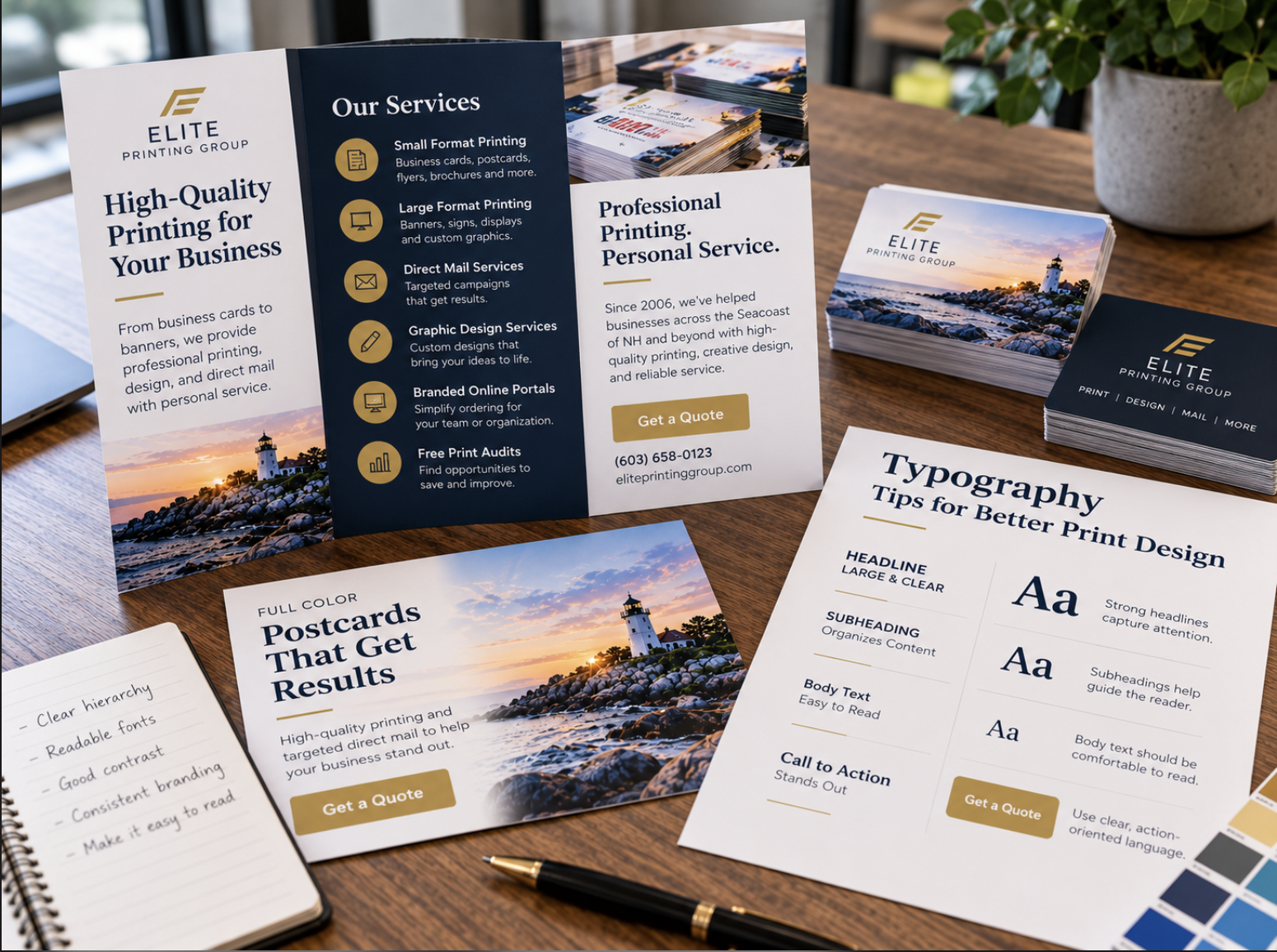
Typography is one of the most influential elements of printed marketing design. The typefaces, sizes, spacing, and layout choices in a brochure, business card, or flyer determine how easily readers can recognize the main message, find supporting details, and take the intended next step.
A design that looks polished on a computer monitor may not communicate as effectively once it is printed. Fonts that appear crisp at high zoom can become difficult to read at actual size, and layouts that feel balanced on screen can feel crowded on paper.
Effective print typography considers both appearance and readability, along with the practical requirements of producing a physical product.
The most useful printed typography helps readers understand the message quickly, locate important information without effort, and move through the material comfortably.
Whether you're designing materials yourself or working with a graphic designer, the following principles can help you make more informed typography decisions before placing a commercial printing order.
1. Start With a Clear Visual Hierarchy
Before selecting specific fonts, establish how the information should be organized.
A visual hierarchy communicates which elements matter most. The main headline, supporting details, and contact information should each be distinguishable so readers can scan the piece in the intended order.
Without a clear hierarchy, even attractive typography can feel disorganized.
Lead With the Main Headline
The headline typically carries the primary message and deserves the greatest visual prominence.
Its size should reflect the printed format and the intended viewing distance rather than simply filling available space.
Organize Supporting Information
Subheadings, short paragraphs, and clearly separated sections help readers move from the main message to supporting details.
A brochure covering several services benefits from distinct sections rather than one continuous block of text.
Emphasize the Call to Action
If the material is intended to encourage a response, the call to action should be easy to locate.
Use size, weight, spacing, or placement to distinguish it from surrounding content without competing with the headline.
2. Choose Readable Fonts for the Intended Format
Not every typeface works equally well in every printed application.
A decorative font may create a distinctive headline but become difficult to read when used for a long paragraph or small contact details.
Both serif and sans-serif typefaces can work well in professional print design. The appropriate choice depends on the specific font, audience, message, and visual style.
Prioritize Clarity for Essential Information
Phone numbers, email addresses, dates, and instructions should use clear letterforms with consistent spacing.
Avoid highly stylized typefaces for details that need to be read accurately.
Limit the Number of Fonts
Using several unrelated typefaces can make a printed piece feel inconsistent.
A limited, coordinated selection of complementary fonts often communicates more clearly than a layout that combines many different styles.
3. Use Appropriate Font Sizes
Font size should be evaluated relative to the finished dimensions and the expected viewing distance.
Text that appears readable at high zoom on a monitor may become uncomfortable to read at the actual printed size.
Consider the Viewing Distance
A business card viewed from a few inches away can use smaller text than a banner intended to be read from across a room.
For many close-viewed printed materials, approximately 10–12-point body text can be a useful starting point, depending on the typeface and audience.
However, this isn't a universal rule. Large-format signs, detailed brochures, and materials intended for different audiences may require other sizes.
Avoid Shrinking Text to Fit More Content
Reducing the font size indefinitely to fit additional information may create a layout that looks balanced on screen but is difficult to read in person.
Rather than shrinking every line, consider simplifying the content or adjusting the layout.
Review the Finished Size
Whenever practical, print a sample at the intended dimensions before approving the artwork.
A physical proof can reveal text that feels too small or too tightly spaced.
4. Maintain Strong Contrast
Contrast between text and background helps important information remain visible.
Light text on a similarly light background may be difficult to distinguish, particularly under certain lighting conditions.
Evaluate Contrast in Context
A color combination that appears clear on a backlit screen may not reproduce the same way on a printed sheet.
Paper stock, coatings, and the printing process can all affect how colors and contrast appear.
Be Cautious With Text Over Images
Placing text over a busy photograph can reduce readability if the background lacks a consistent area for the lettering.
Where necessary, reposition the text, add a subtle background, or choose a simpler image.
5. Use Spacing to Improve Readability
Spacing is as important as the typeface itself.
Line spacing, paragraph spacing, and margins all influence how comfortably readers can move through the material.
Line Spacing
Text that is set too tightly can feel cramped, while overly loose spacing can make it difficult to follow from one line to the next.
Appropriate line spacing depends on the typeface, size, and line length.
Paragraph and Section Spacing
Clear separation between paragraphs and sections helps readers recognize where one topic ends and another begins.
Margins and White Space
Adequate margins prevent the layout from feeling crowded and help keep important content away from the finished edge.
White space is not wasted space. It helps organize content and gives the design room to breathe.
6. Pay Attention to Line Length and Text Alignment
The width of a paragraph affects how comfortably readers can move from one line to the next.
Very long lines can make it difficult to find the beginning of the next line, while extremely narrow columns may interrupt reading with frequent line breaks.
The ideal line length varies depending on the typeface, font size, and printed format.
For brochures, printed reports, and informational materials, avoid stretching dense paragraphs across unnecessarily wide areas.
Using appropriate columns or adjusting the layout can create a more manageable reading experience.
Left-Aligned Text
Left-aligned body text is common in English-language materials because it creates a consistent starting point for each line.
It is often a practical choice for longer paragraphs.
Centered Text
Centered text can work well for short headlines, invitations, or brief promotional messages.
However, long centered paragraphs may become harder to follow because the starting point changes from line to line.
Justified Text
Justified text aligns both the left and right edges of a paragraph.
It can create a formal appearance, but poor spacing and narrow columns may introduce uneven gaps between words.
If using justified text, review the layout carefully for distracting spacing.
The goal is to choose alignment based on the amount of text and the intended reading experience, not simply the visual style.
7. Keep Typography Consistent With Your Brand
Typography is an important part of brand identity.
If your business uses one set of fonts on its website, another on business cards, and several unrelated styles on brochures and printed advertisements, the overall presentation can feel disconnected.
A consistent typographic approach helps customers recognize materials as coming from the same organization.
This doesn't mean every printed piece should use identical font sizes or layouts.
A business card, brochure, direct mail postcard, and large banner have different communication requirements.
However, they can still share recognizable typefaces, heading styles, and design principles.
Establish Approved Fonts
Businesses that regularly produce printed materials may benefit from defining a small set of approved fonts.
This provides designers and employees with clear guidance when creating new artwork.
Define Basic Heading Styles
A brand guide can identify how primary headings, subheadings, and body text should generally appear.
These styles can be adapted for different formats while preserving a consistent identity.
Coordinate Print and Digital Typography
When practical, printed materials should feel connected to the company's digital presence.
However, fonts and layouts may need adjustments to remain effective in different environments.
The goal is visual consistency, not identical formatting across every medium.
For businesses preparing coordinated marketing materials, Elite Printing Group offers Graphic Design Services.
8. Design Typography Around the Intended Audience
Typography should always account for the people who will be reading the material.
A printed document designed for employees in a controlled office environment may have different requirements from a public-facing brochure intended for a broad audience.
Similarly, an event sign viewed from a distance needs a different approach from a detailed informational handout.
Consider the following questions:
- Who is the intended audience?
- How close will readers be to the material?
- Will the piece be read indoors or outdoors?
- Is the content brief or information-heavy?
- Does the audience need to locate specific information quickly?
- Are there accessibility considerations that should influence the design?
For materials intended for a broad public audience, conservative font sizing, clear contrast, and straightforward layouts can help improve usability.
Avoid relying on extremely thin lettering, small text, or decorative typefaces for essential information.
It can also be useful to test a design with people who were not involved in creating it.
Their feedback may reveal difficulties that the designer has become accustomed to overlooking.
Accessibility Requires More Than Font Choice
Readable typography is one part of accessible communication, but it does not guarantee that a printed piece meets every accessibility need.
Depending on the audience and purpose, organizations may need to consider alternative formats, language accessibility, or other requirements.
For more guidance, read our article on Accessible Print Design Tips.
9. Avoid Common Typography Mistakes
Certain typography problems appear repeatedly in business marketing materials.
Recognizing them early can help improve the finished design.
Using Too Many Fonts: Combining several unrelated typefaces can create visual clutter and weaken brand consistency. Use a limited, coordinated selection whenever practical.
Making Text Too Small: Reducing font size to fit more information may make the final piece difficult to read. Consider simplifying the message or adjusting the layout instead.
Using Weak Contrast: Light text on a similarly colored background may be difficult to distinguish after printing. Evaluate contrast under realistic viewing conditions.
Overusing Capital Letters: All-uppercase text can provide emphasis for short headings, but lengthy passages in capital letters may become harder to scan. Use capitalization intentionally rather than applying it to every section.
Crowding Text Against the Edges: Important information placed too close to the finished edge may look cramped or be affected by trimming. Follow the appropriate safe-area recommendations for the project.
Using Decorative Fonts for Essential Information: Highly stylized lettering may be visually interesting but can interfere with readability when used for phone numbers, addresses, instructions, or other important details.
Ignoring the Printed Size: A design that looks clear at high zoom may not be readable at its actual dimensions. Always evaluate the finished scale.
Allowing Inconsistent Spacing: Irregular line spacing, paragraph gaps, and heading margins can make a design feel disorganized. Consistent spacing helps establish a more predictable reading experience.
10. Review Typography Before Approving the Final Artwork
A careful review is essential before sending artwork into production.
Even when the design appears correct in its original software, exporting the file can sometimes introduce unexpected changes.
Fonts may be substituted, line breaks may shift, or certain characters may not display correctly.
Before submitting the final file, open the exported PDF and inspect the actual artwork.
Check Font Rendering
Confirm that all text appears in the intended typefaces and that no characters are missing.
Proper font embedding or other file preparation steps may be necessary depending on the printing workflow.
Review the Reading Order
Make sure headings, body text, and calls to action follow a logical sequence.
The reader should be able to identify where to begin and what information matters most.
Check Readability at Finished Size
Whenever practical, print a sample at the intended size.
A physical sample can help reveal text that feels too small, insufficiently spaced, or difficult to distinguish.
Verify Important Information
Double-check phone numbers, email addresses, website URLs, event dates, and other critical details.
Even visually excellent typography cannot compensate for inaccurate information.
Confirm Production Specifications
Review the intended dimensions, bleed, safe areas, and any special finishing requirements.
For additional guidance, explore our article on Bleed, Trim, and Safe Areas.
Typography Checklist for Printed Marketing Materials
Before approving your next printing project, review the following:
- The main headline clearly communicates the primary message.
- Headings and subheadings create a logical visual hierarchy.
- Body text is readable at the intended printed size.
- Font choices are appropriate for the audience and purpose.
- Decorative fonts are limited to suitable applications.
- Text and background colors provide sufficient visual contrast.
- Line spacing and paragraph spacing support comfortable reading.
- Margins and white space prevent the layout from feeling crowded.
- Text alignment is appropriate for the amount of content.
- Typography is consistent with the company's branding.
- Important information is easy to locate.
- The exported file preserves the intended fonts and layout.
- The design has been reviewed at the actual finished size.
- Contact information, dates, and other details have been proofread.
These considerations apply to a wide range of commercial printing projects, although the most appropriate typography choices will vary by format.
Better Typography Creates Better Printed Communication
Typography affects much more than appearance. It influences how quickly readers recognize important information, how comfortably they move through a document, and how clearly a business communicates its message.
Good print typography begins with a logical hierarchy, readable fonts, appropriate sizing, sufficient contrast, and thoughtful spacing.
Those fundamentals should then be adapted to the intended audience, viewing environment, and printed format.
A business card may require concise information and careful use of limited space, while a brochure benefits from organized sections and comfortable paragraph formatting. Large-format signage places greater emphasis on viewing distance and immediate recognition.
The most effective typography is often the typography that allows readers to focus on the message rather than the design itself.
By reviewing these details before production, businesses can create printed materials that are more organized, readable, and appropriate for their intended use.
Create Clear, Professional Print Materials With Elite Printing Group
Since 2006, Elite Printing Group has provided commercial printing, graphic design, and personalized service to businesses and organizations. Based in the Seacoast of New Hampshire, we serve customers throughout New England and offer nationwide shipping.
Whether you're developing business cards, brochures, postcards, presentation materials, or large-format graphics, thoughtful typography can help your message remain clear and professional.
Explore our Graphic Design Services, learn more about our Small Format Printing and Large Format Printing services, or Get a Quote to discuss your next project.