
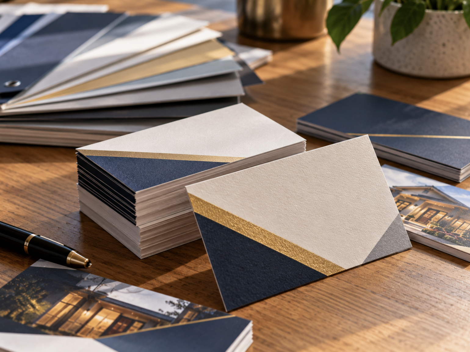
A business card may be small, but it can play an important role in how someone remembers and reconnects with your business. Whether you're meeting a potential customer, attending a networking event, introducing yourself to a referral partner, or speaking with someone at a trade show, a well-designed card provides a convenient way to share essential information.
Even in a world of smartphones, websites, and digital contact sharing, physical business cards remain a practical tool for professional introductions. They don't require someone to open an app or immediately save a contact. Instead, they provide a tangible reminder of a conversation that can be reviewed later.
However, not every business card is equally useful.
Some cards feature attractive designs but make contact information difficult to read. Others contain so much information that the most important details become lost. And some use paper or finishes that don't suit how the card is intended to be handled.
A business card worth keeping combines clear information, professional design, recognizable branding, and a practical reason for the recipient to hold onto it.
Whether you're creating your first business card or updating an existing design, the following considerations can help you make more informed choices.
1. Start With the Information People Actually Need
The most important purpose of a business card is to help someone identify your business and contact you.
Before selecting colors, paper, or finishing options, determine which information should appear on the card.
For many businesses, the essentials include:
- Your name: So the recipient knows who they met.
- Company name: To clearly identify the business or organization.
- Job title or role: When it helps explain your responsibilities.
- Phone number: If calling or texting is an appropriate contact method.
- Email address: For professional inquiries and follow-up.
- Website: Where recipients can learn more about your business.
Depending on the company, a physical address, relevant social media profile, or other contact detail may also be appropriate.
However, including more information doesn't automatically make a card more useful.
Prioritize the Most Important Contact Method
Think about how you want people to reach you after the initial conversation.
A service-based business may prioritize its phone number and website, while a professional consultant may place greater emphasis on an email address or scheduling page.
A business with a physical storefront might benefit from including its location if in-person visits are important.
The design should make the preferred contact information easy to find.
Avoid Unnecessary Clutter
Trying to fit every social media account, service description, slogan, and promotional message onto a small card can make the information difficult to read.
If additional details are important, consider whether they would be better placed on a brochure, website, or separate marketing piece.
A business card should make follow-up easier, not attempt to communicate everything about the company.
2. Make the Business Name and Logo Recognizable
Your business card is part of your company's visual identity.
It should feel connected to your website, signage, brochures, and other marketing materials.
Using the correct logo, approved colors, and consistent typography helps customers recognize your business across different interactions.
For example, someone who receives your business card at a networking event may later visit your website.
If the branding is consistent, the two experiences feel more connected.
Use the Correct Logo File
Whenever possible, begin with an approved, high-quality version of your company's logo.
Vector artwork is often preferable because it can generally be resized without losing sharpness.
Avoid using logos copied from screenshots or low-resolution website images when better source files are available.
Preserve Proper Logo Proportions
A logo should not be stretched, distorted, or compressed simply to fit into the available space.
If the original logo doesn't work well within the layout, consider using an approved alternate version or adjusting the composition.
Give the Logo Enough Space
Placing a logo too close to surrounding text or decorative elements can make the card feel crowded.
Appropriate spacing helps preserve its visual impact.
The objective is to establish a recognizable brand identity without allowing the logo to overpower the practical contact information.
For more guidance, read our article on Keeping Your Brand Consistent Across Printed Materials.
3. Choose Typography That Remains Readable at Business Card Size
Business cards present a unique design challenge because they contain important information within a relatively small area.
A font that looks attractive on a large computer monitor may become difficult to read when the design is printed at its actual dimensions.
Typography should therefore be evaluated based on the finished card rather than the enlarged digital preview.
Establish a Clear Information Hierarchy
The recipient should be able to identify your name, company, and primary contact details quickly.
This can be accomplished through differences in font size, weight, and spacing.
For example, your name may appear more prominently than your job title, while the contact details remain clearly organized below.
Avoid Excessively Small Text
Shrinking every line to fit more information may create a layout that looks balanced on screen but is uncomfortable to read in person.
Rather than reducing the font size indefinitely, simplify the content or adjust the layout.
The appropriate size depends on the typeface, printing conditions, and intended audience.
Use Decorative Fonts Carefully
Decorative fonts can add personality, but they may be unsuitable for phone numbers, email addresses, and other details that need to be read accurately.
For essential information, prioritize clear letterforms and consistent spacing.
Limit Font Families
A business card rarely needs several unrelated typefaces.
A coordinated selection of fonts can establish visual interest without making the design feel fragmented.
For additional guidance, explore our Typography Tips for Printed Materials.
4. Use White Space to Make the Card Easier to Read
One of the most common mistakes in business card design is trying to fill every available inch.
A crowded layout can make even well-chosen typography and attractive branding difficult to appreciate.
White space refers to the empty or relatively open areas around design elements.
It doesn't necessarily need to be white. The term describes the visual space that separates and organizes content.
When used intentionally, white space can help important information stand out.
For example, providing separation between a person's name and contact details makes the card easier to scan.
Similarly, leaving room around the logo can prevent it from becoming visually tangled with other elements.
Don't Add Information Simply to Fill Space
An uncluttered business card can feel more deliberate than one containing several decorative graphics and unnecessary statements.
If the essential details are already clear, additional content may not improve the card.
Consider Balance and Alignment
Consistent alignment helps create a professional appearance.
Text and graphics should follow a clear organizational structure rather than appearing randomly placed across the card.
Keep Important Content Away From the Edges
Even when a card uses a full-bleed background, essential information should remain inside the recommended safe area.
This helps account for normal trimming tolerances and prevents the layout from feeling cramped.
5. Choose Paper Stock That Fits Your Brand and Intended Use
Paper selection affects how a business card looks and feels when someone handles it.
A thicker cardstock may create a different tactile impression from a lighter option, while the surface finish can influence the appearance of photographs, colors, and text.
However, heavier or more elaborate materials aren't automatically better.
The appropriate paper depends on your branding, intended use, budget, and available production options.
Consider the Weight and Feel
Some businesses prefer a substantial card because it aligns with their desired presentation.
Others may prioritize a straightforward, practical option for frequent distribution.
Neither approach is inherently more professional.
The important question is whether the material suits the purpose of the card.
Matte vs. Gloss Finishes
Matte finishes generally have a lower-shine appearance and can complement clean typography and understated branding.
Gloss finishes are more reflective and may emphasize colorful graphics or photography.
The exact result depends on the specific stock, coating, and printing process.
If you want a deeper comparison, read our guide to Matte vs. Gloss Printing Finishes.
Consider Handwriting
Some people write notes on business cards after a meeting to remember the conversation.
If your card is intended to accommodate handwritten notes, confirm whether the selected paper and finish are suitable.
Certain coated or laminated surfaces may not work well with ordinary pens or pencils.
Review Physical Samples When Practical
A card's paper thickness and finish can be difficult to judge from a screen.
When material selection is important, reviewing suitable samples can help you understand how the finished card may feel and appear.
6. Should You Print on One Side or Both Sides?
One of the decisions businesses face is whether to print information on the reverse side of the card.
There isn't one universally correct answer.
A single-sided design can be clean and straightforward, particularly when the front already contains all essential information.
A double-sided design offers additional space for branding, supporting information, or a relevant next step.
Useful Options for the Back of a Business Card
Depending on the purpose of the card, the reverse side might include:
- A company logo or short tagline.
- A concise description of the primary service.
- A QR code linking to a relevant website.
- An appointment-related detail.
- A small amount of additional contact information.
- A simple visual design reinforcing the brand.
However, the additional space shouldn't become an excuse to overload the card.
Leaving the Back Blank Can Be Intentional
An uncluttered reverse side may provide room for handwritten notes or simply maintain a more minimal presentation.
That can be useful for professionals who regularly exchange cards during meetings and networking events.
The decision should reflect how the recipient is expected to use the card rather than the assumption that every available surface needs to contain information.
7. Should You Add a QR Code to Your Business Card?
QR codes can connect a physical business card to digital information.
When scanned with a smartphone, a QR code may direct someone to a website, contact page, appointment scheduling system, or another relevant destination.
This can be useful when the business wants to offer more information than can reasonably fit on the printed card.
However, a QR code isn't necessary for every business card.
Choose a Useful Destination
A QR code should lead somewhere relevant.
For example, a professional service provider might direct recipients to a contact page or service overview.
A company attending a trade show could use a QR code to share additional information about a particular offering.
The destination should match the context in which the card is distributed.
Explain What the Code Does
Where space allows, consider including a short label such as "View Our Services" or "Visit Our Website."
This gives the recipient a clearer reason to scan it.
Test Before Printing
QR codes need sufficient size, contrast, and clear space to function reliably.
Before approving the artwork, test the code using a smartphone and verify that the destination loads correctly.
Check that the linked page works on mobile devices.
Don't Replace Every Contact Detail With a QR Code
Not everyone will want to scan a code.
Important information such as your name, company, and primary contact method should remain accessible without requiring a smartphone.
A QR code should support the card's usefulness rather than create an unnecessary barrier.
8. Make Your Business Card Useful for Networking and Follow-Up
A business card is most valuable when it helps continue a professional relationship.
The design should support that purpose rather than focus exclusively on appearance.
Consider how the card will be distributed and who is likely to receive it.
For example, a business owner attending community networking events may want a straightforward card that makes contacting the company easy.
A sales representative at an industry trade show might benefit from a card that clearly identifies the business and provides a relevant online destination.
A professional consultant may prioritize direct contact information and a concise description of their role.
Focus on Relevance
The information should match the relationship you're trying to establish.
If the recipient already knows what your business offers, the most important detail may simply be how to reach you.
If you're introducing a less familiar service, a brief descriptor may provide useful context.
Avoid Excessive Promotional Language
A business card doesn't need to function like an advertisement filled with several sales claims.
Clear, accurate information can provide a more practical foundation for follow-up.
Keep Your Information Current
Outdated contact information undermines the purpose of a business card.
If an employee changes roles, leaves the company, or receives a new phone number, review the related card design before ordering more.
A card is only useful when the information on it is accurate.
9. Prepare Business Card Artwork for Professional Printing
Once the design is finalized, the file needs to be prepared for the printing process.
A business card may appear simple, but it still requires attention to dimensions, bleed, safe areas, fonts, and image quality.
Confirm the Finished Dimensions
A common business card size in the United States is 3.5 × 2 inches.
However, specific product dimensions and available options should be confirmed with your printing provider.
Include Bleed When Required
If the design includes a background color or photograph that extends to the edges, additional bleed artwork may be necessary.
A common example for certain commercial print products is 0.125 inches of bleed per side, but requirements vary.
Keep Essential Information Inside the Safe Area
Names, phone numbers, logos, and other important details should remain comfortably within the recommended margins.
This helps account for normal cutting tolerances.
Use High-Quality Graphics
Logos and other graphics should have suitable resolution or vector quality for the intended printed size.
Avoid enlarging low-resolution images beyond their useful dimensions.
Export According to the Printer's Requirements
PDF is a common format for commercial printing, but file preparation specifications can vary.
Confirm the appropriate settings, including fonts, dimensions, color handling, and any required bleed.
For a detailed explanation, see our guide to Preparing Print-Ready Files.
10. How Many Business Cards Should You Order?
The right quantity depends on how frequently cards are distributed and how long the contact information is expected to remain accurate.
A professional who attends several networking events each month may need a different quantity from someone who distributes cards only occasionally.
Similarly, a company ordering cards for several new employees should consider whether the same design will remain appropriate as roles or contact information change.
Estimate Expected Distribution
Review how many cards are typically used during meetings, events, and other professional interactions.
If you've ordered business cards before, previous usage can provide a useful starting point.
Consider Upcoming Changes
If your business is planning a rebrand, changing contact information, or updating employee roles, a smaller quantity may provide more flexibility.
Compare Total Cost
Larger quantities can sometimes reduce average printing costs, depending on the project specifications.
However, a lower cost per card doesn't necessarily represent better value if many cards become outdated.
Maintain a Practical Reserve
Having a reasonable supply available can help avoid running out before important events.
At the same time, unnecessary inventory of employee-specific cards may create waste.
For more guidance, read How Many Printed Materials Should Your Business Order?.
11. Common Business Card Design Mistakes to Avoid
Even a professionally printed card can become less useful when important design details are overlooked.
Including Too Much Information
Excessive text can make the card crowded and difficult to read.
Prioritize the details recipients are most likely to need.
Using Fonts That Are Too Small
Text may look acceptable at high zoom but become uncomfortable to read at actual size.
Review the finished dimensions before approving artwork.
Using Low-Resolution Logos
A blurry or pixelated logo can undermine an otherwise polished design.
Use high-quality source artwork whenever possible.
Poor Color Contrast
Contact information should remain clear against the background.
Avoid combinations that make important text difficult to distinguish.
Placing Text Too Close to the Edge
Insufficient safe margins can make the layout feel cramped and create unnecessary trimming risks.
Using Outdated Contact Information
Double-check phone numbers, email addresses, websites, and employee titles.
Choosing Materials Without Considering Practical Use
A finish that looks appealing may not suit handwriting or other requirements.
Consider how the recipient will handle the card.
Adding an Unnecessary QR Code
A QR code should serve a clear purpose and lead to a useful destination.
It shouldn't be included simply because the technology is available.
Skipping the Final Proof Review
Always inspect the actual exported artwork before authorizing production.
These mistakes are often avoidable with a thoughtful design process and careful review.
Business Card Design Checklist
Before placing your next business card order, review the following:
Information and Branding
- The company name and logo are correct.
- Employee names and job titles are accurate.
- Phone numbers, email addresses, and website URLs are current.
- The card uses approved brand colors and typography.
- Unnecessary information has been removed.
Design and Readability
- Important information is easy to locate.
- Text is readable at the finished card size.
- The layout has sufficient spacing and clear alignment.
- Text and background colors provide appropriate contrast.
- Logos and other graphics are high quality.
- Essential elements remain inside the recommended safe area.
Materials and Production
- The finished dimensions have been confirmed.
- Paper stock and finish suit the intended use.
- Handwriting requirements have been considered, if applicable.
- Bleed is included where required.
- Any QR codes have been tested.
- The final exported file has been reviewed.
- The order quantity reflects expected use.
- Production and delivery requirements have been confirmed.
A practical checklist helps ensure that the design works as intended before the cards are produced.
What Makes a Business Card Truly Worth Keeping?
A memorable business card doesn't necessarily need elaborate finishing, unusual dimensions, or a complicated design.
In many cases, the most useful cards are the ones that communicate information clearly and make professional follow-up convenient.
A recognizable logo, readable contact details, appropriate paper stock, and thoughtful layout can create a card that reflects the business while remaining practical for the recipient.
The right design depends on the audience, the relationship being established, and how the card is likely to be used.
For businesses, the objective should be to create a card that supports a real professional interaction rather than simply attracting attention for a few moments.
A business card worth keeping gives someone a reason to remember the connection and an easy way to continue it.
Create Professional Business Cards With Elite Printing Group
Since 2006, Elite Printing Group has provided commercial printing, graphic design, and personalized service to businesses and organizations. Based in the Seacoast of New Hampshire, we serve customers throughout New England and offer nationwide shipping.
Whether you're updating your existing business cards, preparing materials for a networking event, or creating a coordinated set of branded marketing materials, our team can help you discuss printing and design options suited to your project.
Explore our Small Format Printing Services, learn more about our Graphic Design Services, or Get a Quote to discuss your next business card project.